Blog WHS website
Spring Cleaning
Over the past 6 weeks, I have spent 3 to 4 hours a day improving much of the outdated content on this website. Country by country, I touched upon every single WHS site page; all 1154 of them. I replaced old photos, verified links, spell-checked texts, and re-evaluated reviews. I finished last week with Spain and Italy, which took a full day each but brought back good memories of so many short trips. Find below what I learned from it, plus some hints on how you can help to improve these pages even more.

1. Site Intro
Every WHS site page starts with a short introduction to the WHS and one identifying photo. I tackled these photos first, some were over 15 years old. They were tiny, scanned from an analog photo, or unsharp in general. In the process, I replaced 633 old photos with bigger/better/newer/sharper ones. But there are still 85 photos left that are older than 10 years. Can you help refresh them? I've provided a list and the requirements at the Forum.
The intro texts I haven’t yet touched content-wise (that may be a project for next year). But I did try to make them all of a similar length. So some became shorter, and others got a few extra lines. Especially for the newer sites without clear OUV, I find it hard to write something.
2. Reviews
The review sections also have had a major upgrade. Starting with my own reviews: I have moved most (583 out of 755) of them to the generic “Community Reviews” section. While copying them I did a spell-check (finding out that I make the same mistakes over and over again – I seem to not be able to spell “volcano” right for example). I can recommend other non-native English speakers to use a tool like Grammarly as well.
Regarding the Community Reviews: I disabled 205 reviews of other people, less than 3% of the total. I still have been quite lenient I think in the interpretation of “quality”, but have removed those without proper punctuation marks, the ones that were written as a school exercise, or without clear reference to actually having been there, and those just stating that they loved the shops or pointing to outdated weblinks.
What I noticed, in general, is that some countries are seriously under-reviewed: Armenia is a good example. Norway also has not that many contributions. Other sites seem over-reviewed (Vienna, Cologne Cathedral) but lack substance. The serial transnational sites on the other hand seem popular for all their locations to cover: there’s a great spread among the Beech forests, Struve Arc and Le Corbusier reviews!
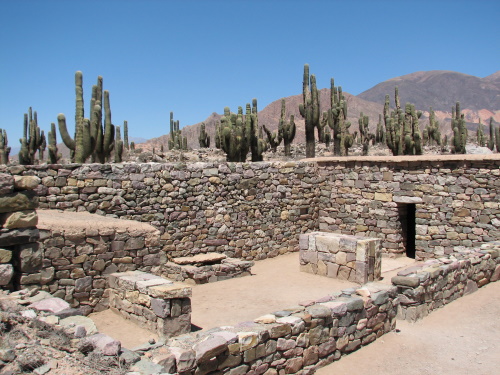
If you’re looking for an original review to write: I’ve made a list of sites that have not been reviewed in the past 10 years – it includes Quebrada de Humahuaca for example (pictured below), and the Drakensberg Mountains.

3. Site Links
Surprisingly, the most effort went into the Site links section. I verified the links of all official and related websites. Some brought me to casino websites or triggered browser security warnings. I had to throw away a lot, including “official” web pages. So now we're left with 84 WHS without reference to an official website!
Some countries also have significantly improved their web presence in English. Glamorous national tourism websites all named “Visit [countryname]” have been developed, such as Visit Saudi (“Welcome to Arabia”) and Visit Montenegro (“Breathtaking Beauty”). There now even is a Visit Pitcairn for those who want to hit Henderson Island.
Els - 8 May 2022
Comments
Martina Ruckova 8 May 2022
Amazing work done, Els, as always! As a regular, I would like to say to all of you who review sites, Ivan and I love reading your insights both before and after our own visit. They are a great source of information and many are very amusing. I will try to add some more of my own where they might be helpful.
Jay T 8 May 2022
Thank you for all the work you put into this site — I really enjoy the layout and the reviews, as well as the community here. I’ll see if I can find some photos for a couple sites you are hoping to update.